
康康之家品牌形象设计定稿
发布时间:2021-09-22 16:24
北斗设计x康康之家
经过一个多月的努力,康康之家的品牌形象落下帷幕,北斗设计携手康康之家,为其创作了品牌logo,vi运用,还有品牌传播海报设计等项目。
康康之家是北斗设计接手的第一个养生品牌形象设计项目,这里非常感谢韩总对于北斗设计信任与支持。对于康康之家,客户的战略定位是期待为每个家庭带来健康幸福。从品牌的名字上去联想,也是非常纯粹的记忆,所以我们在创意的过程也期望为消费者塑造一种简单明了设计视觉形象,带给我们的目标用户一种美好的视觉体验。
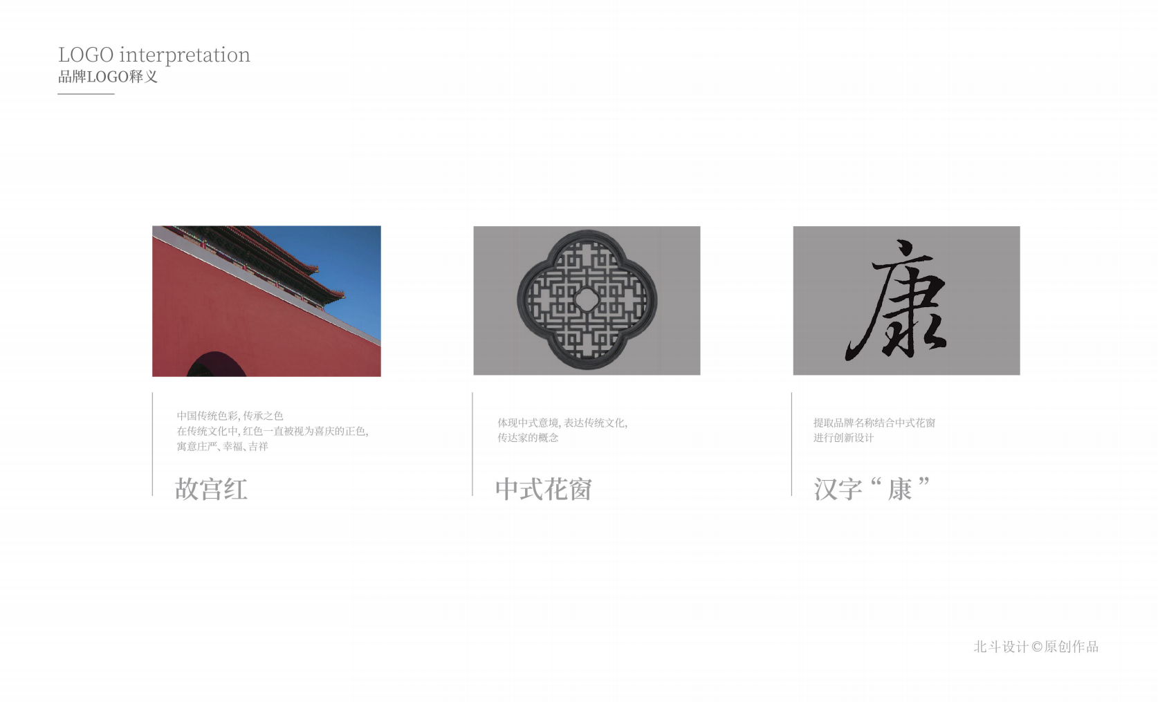
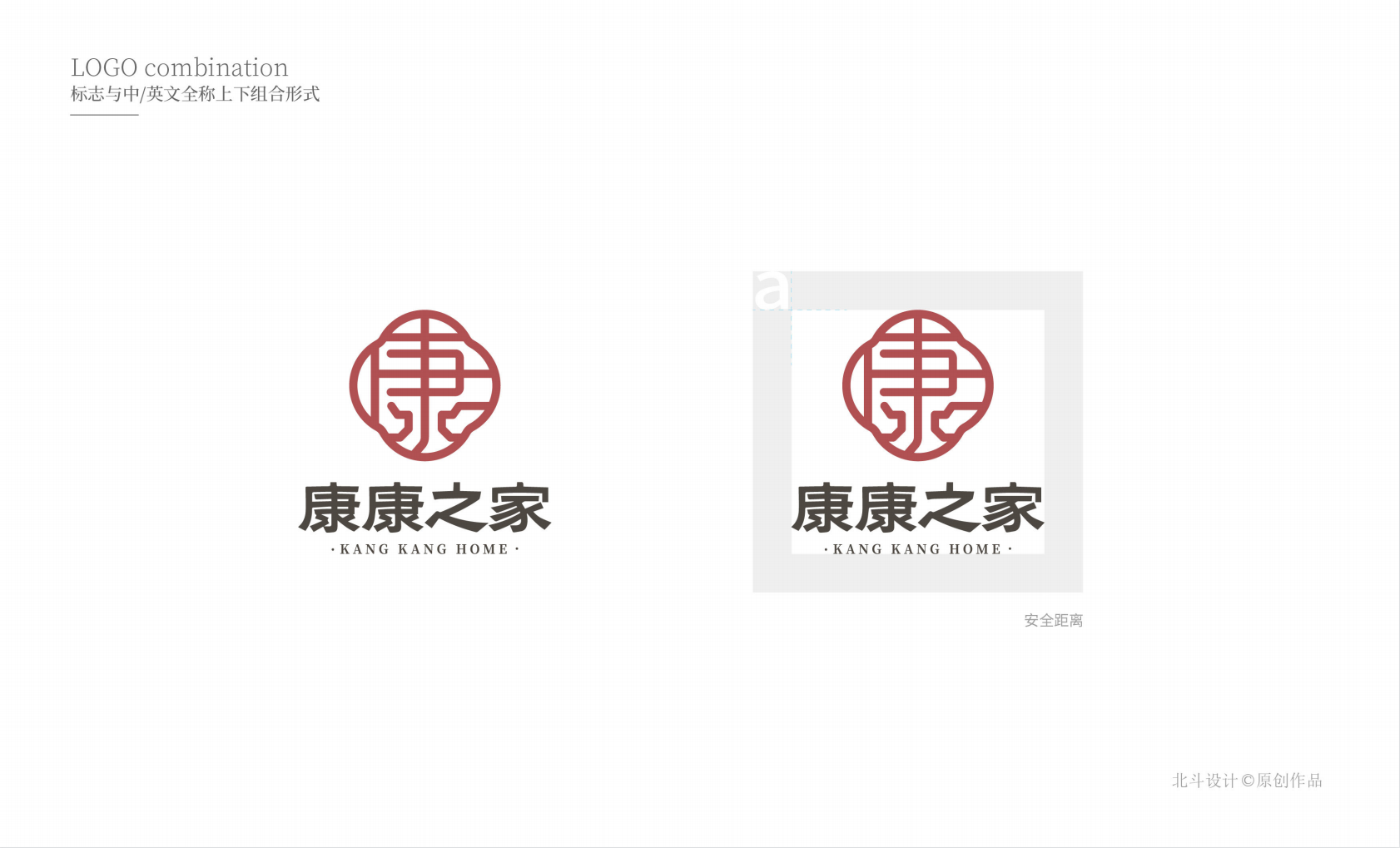
康康之家,核心是在于“康”,我们把康字作为品牌的战略符号来进行创意,赋予品牌一个独特的符号资产,为品牌后续营销传播降低品牌认知成本。
康康之家图形创意来源
康字的符号表现在同行业或者非同行之中已有不少品牌在使用,如何来区分,将自己的个性表现出来,首先我们先明确和客户沟通的需求,就是品牌的风格定位,客户她期望康康之家呈现的是一种新中式的美学形态,给人一种简洁而富含中式文化的体验。首先我们从色彩上,攫取了故宫红作为康康之家的品牌主色调,为了能够体现出中式文化,我们找到了一个最具代表的窗格符号作为嫁接导入,使得品牌的符号风格更加具有个性。后续的品牌vi运用和品牌传播海报设计将在有空之余整理出来与大家分享,感谢关注北斗设计新闻案例。
经过一个多月的努力,康康之家的品牌形象落下帷幕,北斗设计携手康康之家,为其创作了品牌logo,vi运用,还有品牌传播海报设计等项目。
康康之家是北斗设计接手的第一个养生品牌形象设计项目,这里非常感谢韩总对于北斗设计信任与支持。对于康康之家,客户的战略定位是期待为每个家庭带来健康幸福。从品牌的名字上去联想,也是非常纯粹的记忆,所以我们在创意的过程也期望为消费者塑造一种简单明了设计视觉形象,带给我们的目标用户一种美好的视觉体验。
康康之家,核心是在于“康”,我们把康字作为品牌的战略符号来进行创意,赋予品牌一个独特的符号资产,为品牌后续营销传播降低品牌认知成本。
康康之家图形创意来源
康字的符号表现在同行业或者非同行之中已有不少品牌在使用,如何来区分,将自己的个性表现出来,首先我们先明确和客户沟通的需求,就是品牌的风格定位,客户她期望康康之家呈现的是一种新中式的美学形态,给人一种简洁而富含中式文化的体验。首先我们从色彩上,攫取了故宫红作为康康之家的品牌主色调,为了能够体现出中式文化,我们找到了一个最具代表的窗格符号作为嫁接导入,使得品牌的符号风格更加具有个性。后续的品牌vi运用和品牌传播海报设计将在有空之余整理出来与大家分享,感谢关注北斗设计新闻案例。
Beidou Design x Kangkang House
After more than a month of hard work, the brand image of Kangkang House came to an end. Beidou Design and Kangkang House worked together to create a brand logo, vi application, and brand communication poster design for it.
Kangkang Home is the first health brand image design project taken over by Beidou Design. I am very grateful to Mr. Han for his trust and support for Beidou Design. For Kangkang Home, the customer's strategic positioning is to look forward to bringing health and happiness to every family. Associating from the brand name is also a very pure memory, so we also hope to create a simple and clear design visual image for consumers in the creative process, and bring a beautiful visual experience to our target users.
The core of Kangkang Home lies in "Kang". We use the word "Kang" as a brand's strategic symbol to create ideas, give the brand a unique symbolic asset, and reduce the cost of brand recognition for the brand's subsequent marketing and communication.
Kangkang House Graphic Creative Source
The symbol of "Kang" has been used by many brands in the same industry or non-peers. How to distinguish and express our own personality? First of all, we first clarify the needs of communicating with customers, which is the style positioning of the brand. It is expected that the Kangkang House will present a new Chinese aesthetic form, giving people a concise and rich Chinese culture experience. First of all, from the color point of view, we took the Palace Red as the main color of the Kangkang House brand. In order to reflect the Chinese culture, we found a most representative pane symbol as a grafting import, making the brand's symbol style more individual. The follow-up brand vi application and brand communication poster design will be sorted out and shared with you when I have time. Thank you for your attention to the Beidou design news case.