
恭祝joosup饮料包装设计上市
发布时间:2020-04-08 16:05
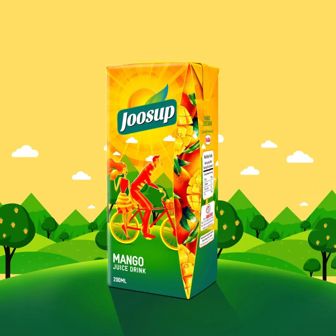
时尚与活力的画面,让joosup年轻起来。
每一个包装设计都包含设计师的一个灵感表现及客户的英明定夺,joosup这款饮料包装设计最吸引用户的是色彩的运用及包装形式感的表现,通过利用包装侧面的位置来展现出产品直观的属性,这也是北斗设计最为强调的:食品包装设计最好的创意在于食物本身的表现。透过这些水果,你就会明白这是一款复合水果饮料,他的营养不止是一种水果这么单调。
我们再看下其元素表现手法也是年轻时尚的插画风格,这种手绘形式能够拉近产品的年轻活力的气氛,更复合年轻人的审美观。
joosup的logo设计也是比较有个性,我们说品牌包装设计不仅要具备美学上的艺术设计,也要具备商业上的认知设计。所以joosup的字体设计也是简洁明了,没有过多的修饰,同时为了让用户更好地识别品牌的名称记忆,logo设计用了一块绿色来托底,同时采用了绿叶作为点缀,配合包装上面的手绘太阳光的发射形式结合,整个品牌的logo非常的突出。
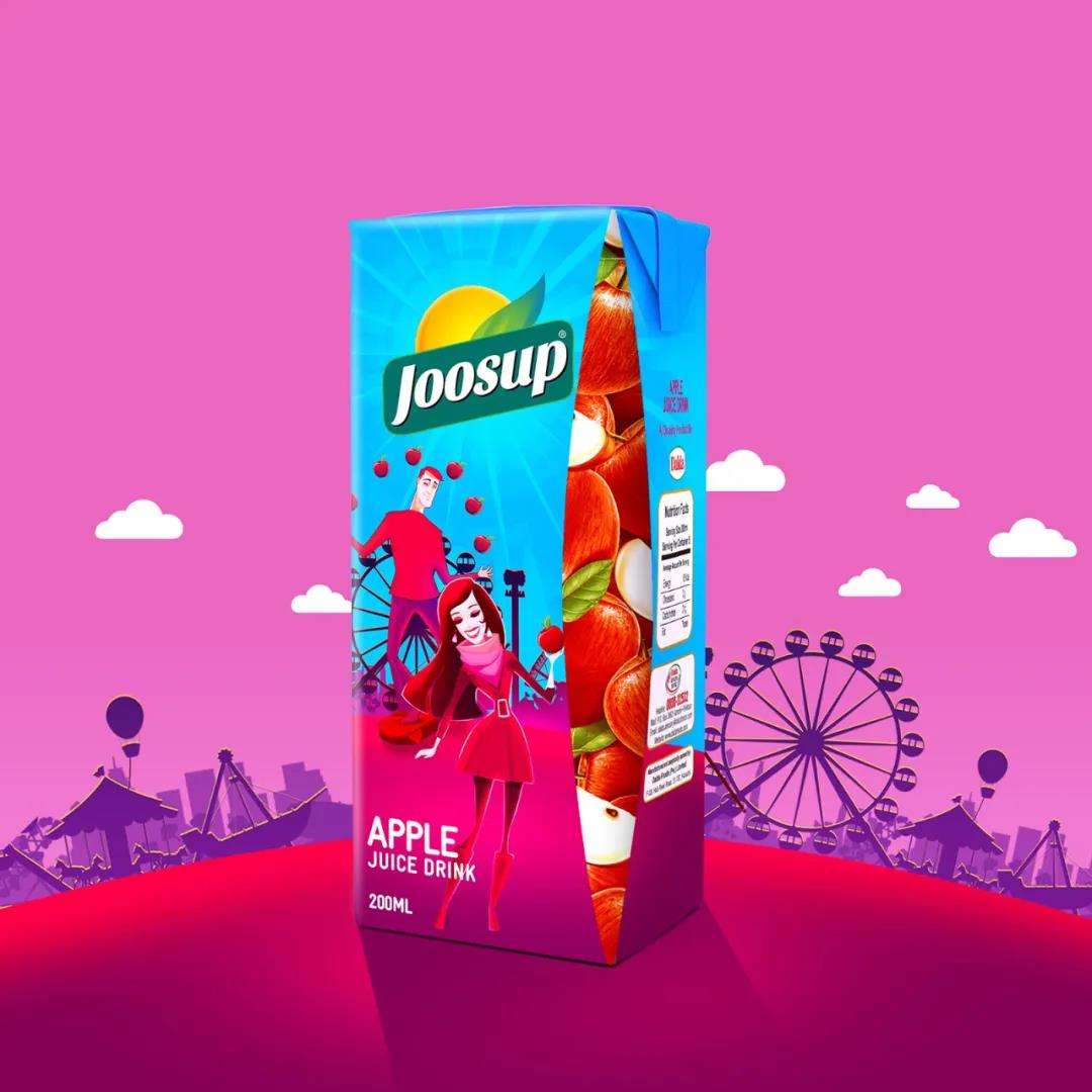
Fashion and vigor, make joosup younger.
Every packaging design includes the designer's a wise decision, inspiration and customer joosup the drink packaging design is the most attracting users is the use of color and the packing form the expression of feeling, through the use of packaging side to show the position of visual properties, it is also a design of beidou most stressed: food packaging design best originality lies in the performance of the food itself. Through these fruits, you will understand this is a compound fruit drinks, he nutrition is more than a fruit so monotonous.
We looked at under the element expression is also a young fashion illustration style, this style of hand-painted products can close the atmosphere of the young vitality, more complex the aesthetic view of young people.
Joosup logo design is also more individual character, we say that the brand packaging design should not only have aesthetic art design, the cognitive design must have a business. So joosup font design is concise and clear, was not decorated too much, at the same time in order to let users better identify the brand name of memory, to the palm with a piece of green, at the same time using the green leaves as an ornament, cooperate with the form of hand-painted the launch of the sun on the packaging, the entire brand logo is very outstanding.